Peter Dimitrov came back with the breakdown of his stunning work, The Neon Graveyard, and shared some tips on mimicking the neon light.
In case you missed it
Learn more about lighting
Introduction
My name is Peter Dimitrov. Some of you might have seen my work through my previous breakdown over here, called The Animal Shrine. I recently graduated with Games Design over at UCLan, and now I am on the lookout for full-time work opportunities. This time I want to introduce you to my second environment, The Neon Graveyard, and go over some of the decisions I took in its production.
The Project
The Neon Graveyard is a passion project with a personal concept behind it, that I also used for part of my thesis at University. With it, I wanted to head towards the sci-fi genre, with a bit of a mix of cyber noir. My previous project was leaning towards fantasy and middle ages, and as such with this one I wanted something a bit different.
The graveyard was assembled in Unreal Engine. I created the models of the buildings and gravestones in Maya while making sculptures in Zbrush. All the textures (apart from the skybox) were created in Substance Designer exclusively for this project. Buildings are made with the use of a tileable brick texture with a parallax occlusion shader. In their case, I took the finished texture directly from the Designer into UE4. Some objects have unique UV space though, and those I textured in Substance Painter, using the library of materials I created in Designer beforehand. For them, I’ve also baked normal, AO, and different channels to aid my process using Painter. Decals and alpha cards used for the making of the neon signs were made in Photoshop. In the next lines, I will try to go over some of my techniques in the making of the mentioned above.
The Story and Initial Idea
I like to source the ideas for my projects from all kinds of places. I believe that if you are attentive enough, you can find inspiration and novel concepts from any type of material. In the case of this one, I got the main inspiration from a short story. Some months after that, way before I had started any work, I took my second bit of influence from a song. The mixture of the two was what started my project.
Whilst going through London, I walked into a small bookshop of antique magazines and books. The kind of place that sells decades-old issues of Weird Tales and aged original comics from Marvel. I picked a cheap, random issue of Analog Science Fiction, to read during my travels. It's the cover illustration is what pulled me into it, and the main story featured in it is where my idea for this environment began.
Figure 1. Analog Science Fiction and Science Fact, November 1972. Cover Illustration by John Schoenherr.
The story is Cemetery World by Clifford D. Simak. If you ask me, it’s a hidden old gem when it comes to ideas. The main thing I took from it though, was the idea that Earth is turned into a cemetery world. Humans have flown in every direction of space. They return to the forgotten Earth, only to be buried after death. For acres to an end, the land is covered with tombstones.
My second bit of inspiration was from Twenty One Pilots. In one of their newest albums, they have a song going by the name Neon Gravestones.
Part of it goes as follows:
Neon gravestones try to call for my bones... call... call... call...
It really stuck with me for a long time and sparked my imagination quite a bit.
Now I needed to gather some more visual material, in order to figure out the direction and atmosphere towards which I was going to head to.
The images didn’t really consist of anything that was per see going to be directly in the project. They just had to guide me towards the abstract mood I had in my mind.
This is when I stumbled upon James Turrell. Before even having done any concrete work, I could see he would have a big influence on the direction I go in with this project.
Figure 3. The chapel building by James Turrell
I discovered a chapel he created situated in a cemetery in Berlin, where supposedly notable German figures like Hegel are buried. His work deals exclusively with the light. He describes that the light does not reveal anything, but is the revelation itself. What I took away from this, is that I would want to focus and treat my lights in the scene as the main objects of interest. I knew that going for a cyberpunk style, my scene would be much more chaotic with light, but I still wanted to use what I learned from Turrell to my best advantage.
You can read in more detail my initial thoughts about the project over at my blog that I wrote then and there, just when starting the project.
First Block-out
At this point, I began working. I started by making a rough block-out directly in Unreal.
Figure 4. The first block-out
Unlike my previous project, where my level layout was influenced by the idea of open space that is walkable by the player, with this one I decided to aim for static shots from the very start. I wanted the whole place to look good from multiple wide angles, but at the same time, I had to focus my attention on a specific direction, ignoring most of the grounds behind the camera.
I decided to roughly follow a rule of thirds. In my main camera shot (seen above), I placed the cathedral on top of a hill. The variation in height was going to make the shot more interesting. The focal point would be the gate and I thought it would be cool to have some sort of glow coming from it. Rule of thirds reminded me of the golden spiral, and that is when I decided to try to make some broken path that starts at the right lower side of the composition and then curves towards the cathedral.
The shot was starting to shape towards what I wanted. Yet the left side of it was still sitting predominantly empty. I liked the idea of the countless gravestones with the little lights on them but was scared that the landscape in the distance sits too empty. Without much time to spend on any interesting foliage or sculpts of barren trees, I knew that there wasn’t much I could do to improve that empty horizon line.
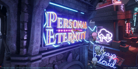
Another thought I had was that I wanted to have many neon signs. That was the aim from the very start. Yet I still didn’t have any of those. And even worse, I didn’t really have the space to hang them on. Having all of that in mind I decided that it would be cool to try to make some kind of crypts and mausoleums to sit to the left.
Figure 5. Initial modeling of the crypts. Work in Maya
And if that was the case, then I would have plenty of space to hang some neon signs on the mausoleums themselves.
Figure 6. Stage of the environment
With the neon signs, I wanted to suggest a story, thus it was the “Personal Eternity” and “Cheap Cloud”. It was still a block-out phase, so many parts didn’t look much futuristic or techno heavy. The Personal Eternity sign even looked maybe a bit too much like Art Deco, and I knew it will need more work. Even at this early phase, I tried to work towards optimized assets. The text on the signs is all on the same bitmap in Photoshop, but I’ll talk more about them later.
Here is a GIF animation of getting to this stage as well. From it, you could spot something I was unsure about.
Figure 7.
I struggled with the gravestones a bit. At first, as seen above, I had them facing the camera. Then I changed my mind and decided that having them pointed directly towards the camera, with the text readable perfectly, they potentially made the image look a bit too banal. Then I changed my mind and decided to place them pointing directly towards the camera with the text readable perfectly, they probably made the image look a bit too banal. That’s when I rotated them towards the spiral path. And that perfectly opened space to scatter more broken pavement. Again, in a spiral shape, to lead the viewer's eye towards the cathedral. And then I took a step back and had them facing us directly again. I asked quite a few people for the feedback, trying to pick between the two. Results were super mixed and in the end, I decided to stick with the version where they don’t face us.
Cathedral Façade. Textures.
Having quite a bit of progress on the block-out, I started focusing more on the individual models and even thinking about textures. I started gathering more reference material about architecture, trying to figure out what I am going to do with the façade of the whole cathedral.
Figure 8. Cathedral facade
I made a brick texture in Designer. In Unreal, I created two materials with it. One shader was with vertex paint, so I can scatter yellowish/dirty brick variation. The second shader deploying a parallax occlusion to give the bricks more dimension. I used that one on the mausoleums and the bits that are actually close to the camera. You can read on how to set up a simple one (just like mine) over here. A benefit from it that I didn’t even consider at first, was that later I could tweak the contact shadows of the lights I had coming from the neon sights that were on the mausoleum’s walls. They interacted very well with the parallax occlusion mapped material and gave it even more dimension when the camera is close.
By the end, I changed the orange hue of the dirty bricks towards more white old stones, like the ones seen in one of the pictures in figure 8. The windows still had no texture, and I had left them with a blue emissive placeholder. I had an idea that I want to have a go at making an interesting stained glass that combines the idea of emission map as well.
At this point my whole scene was looking a bit like this:
Figure 11. Scene Progress
After improving the buildings a bit, I wanted to have a go at working on the neon signs and lights. After all, they were one of the most important elements of my idea. After some hours of work, I got them looking like this:
Figure 12. Scene progress after the neon lights
Making Neon Signs
Most of the text of the signs are on the same bitmap, created in Photoshop. Afterward, in Maya, I cut the different parts of the image onto separate planes in order to get each as individual pieces. Around those planes, I then build a metal frame and countless of wires. The planes have an alpha channel in their bitmap, which is what makes only the text be visible. My workfile from Maya looks like this:
Figure 13. Neon signs as seen in Maya
The big square is the initial plane with a one-to-one mapped bitmap. I then copied it many times and cut different bits of it. The initial version of the neon signs was a plain material in Unreal that had emissive value to make the text glow. It appeared as seen in figure 11. To get them to look a bit more like actual neon – with variation in hue, glow and light – as seen in figure 12, it took a bit more time.
The first thing, that I discovered improved the look immensely, was to work with bordered text (stroke), instead of with plain filled one. In Photoshop I picked a font, wrote my sign and then made it color black. I then set a white border of 3-4 pixels from the Blending Options of the text layer. To get enough hue variation, I decided that it would be cool to have two borders of the same text. I would then mask them inside Unreal’s Material editor and assign them different colors, with their own unique value for emission. To save the in-game performance, doing the borders in Photoshop, I worked on the same bitmap but assigned each border a different color channel. One would be blue, the other green.
An important part is that the colors and emission values are turned into exposed parameters. That way, I can create an instance of my original material and quickly iterate with custom colors. Something, that benefited me a lot in the next step.
Bordered text, as seen in the scene. Inner border white glowing text and outer border dark magenta text.
In static shots, my neons began looking like actual neon signs. What was lacking though, was that when looked from different angles they appeared a bit flat. Also, there wasn’t much movement in the value of the glow and no real change in the color. I wanted to find a better technique to capture that. So, when the camera moves, there is a spill of different colors, as if imitating the movement of gases in neon tubes.
My initial attempt to improve that was to turn the text into 3D geometry. That proved time consuming, and the results were not that impressive. That’s when I discovered a bit by mistake that I can attempt to recreate the illusion described above by using just copies of the same flat text.
What I found was that I can copy my sign and then move it a few pixels backward so then don’t share the exact same space. I then would move it a few pixels down on the Z-axis. That immediately made the text have the illusion of depth. After that, I would assign an instanced copy of the original material. As the original had a blue glow (seen above), I decided to go with something redder in the copy. With each plane being so close to one another, this created one thing I was immensely happy with; with the movement of the camera, there was now a spillage of colors. The red glow would be invisible one second, but then with movement in the next second bleed through and be seen.
The illusion of the depth can be seen very well on the gravestone’s inscriptions.
Figure 17. Gravestones neon signs.
The final steps in some of the neon signs was to give them movement and animations.
Figure 18. Backup your consciousness.
With one of them, I made a drawing of an outlined floppy disk. Then I make four copies of it. Two were with constantly blacked color material. Then two copies in front of them would on a timeline change material and turn from black to emissive green or blue. That way I made the animation seen above.
Figure 19. The New Identity.
Another one I animated by having two texts on the same bitmap and then panning them by U or V coordinates. There is one final improvement that I never got to implement but would sit very well in a scene like this. In front of each neon sign, I have spotlights to give them more believability. If those lights were animated to change in intensity, it would bring the scene even more life. This could be accomplished either with a light function and a sine, or just an animated timeline.
Cyberpunk Caskets
Figure 20. The animated casket.
Given that I was making a techno heavy and cyberpunk world, I could not skip on having a go at making some machinery and technological bits. I wanted to expand on the story and give the gravestones some kind of a purpose. There would be inscriptions in neon on them, but what were they exactly? In my mind, this whole place was some kind of a facility. The caskets could serve a good purpose, but I didn’t want anything that leads to the idea of bodies still being in there. That’s when I decided to try to turn them into some kind of hubs. They would be full of servers and routers, or they could just be some digital storage space.
Figure 21. Work-in-progress stage from Maya.
Early in the project, when blocking out the place, I had figured the initial rough sizing of the gravestones with the caskets lowered down, as if one of a normal grave. Later on, when I needed a break from Unreal, I went into Maya, where I figured out how I am going to create the casket. I had a vague idea for animation as well.
I wanted the casket to have quite a bit of detail and lots of individual bits that I could later animate. I also wanted it quite optimized and not crazy in Polycount. One of the pieces that had a bit of a geometry count on – the fans – I ended up instancing in Unreal. That way animating them was much easier as well, as I only created a rotating movement in one, exposed the values associated with it and then had control over the speed of each, even though they were loaded in the memory only once. If you are making anything similar, you can take a look into Blueprint Rotating Movement Component.
Figure 24. Render from Substance Painter
Figure 25. Materials made in Designer.
In order to have a more manageable polycount, I had to heavily rely on texture. I made a few different patterns and noises that I overlaid and used in different parts on the casket (seen in figure 25).
Figure 26. Animated view of the casket.
Figure 27. A WIP image
The screen I assigned has its own UV texture space. Since the computer's relative scale in space is quite small, I kept its texture pixel size small, too. I wanted some code visible on the screen, and in order to get that with the least effort ever, I went to Unreal, selected an actor from the scene and copied. Then I copied the code Unreal writes to tell the actor where it is positioned in space. In Photoshop I add that into a text layer.
Stained Glass
The initial version of my stained glass was a very simple diamond-shaped pattern. It was frankly too simple, and I knew I will keep it only as a placeholder, as it was giving a weird sparkly look to the windows that I didn’t particularly like. I wanted something glowing and weird, but not exactly the way the diamonds looked like. Later on, I created a more complex texture with circular patterns.
Figure 30. Close up view of the final version.
The pattern was made in Designer. I generated the circular bits, which at first were only black outlines. I then used a Flood Fill to get the shapes within them. The Flood Fill I turned to Flood Fill to Color in order to assign each shape within its own different colors. A masked part of that I also combined with some noises to generate an emissive mask.
If you aim to get the effect like the one above, I would suggest experimenting with an emissive mask that covers a small percentage of the whole texture.
Figure 31. Flood Fill and Flood Fill to Color in action.
Another important part to consider would be the Bloom settings of your scene in your Post Processing Volume. There you can work with the Threshold of the Bloom and capture the value you are using on your emissive mask of the stained glass and make it bloom, without making the rest of the scene glow too much. That way you can get the most out of your emissive mask.
In order to make my pattern, I was partly inspired by Matthias Schmidt's techniques. Check them out if you plan on making anything similar.
Afterword
When working on scenes of this scale, I always find my process to be the most straightforward when I start with block-outs in Unreal. As such, I would suggest putting a lot of effort into it. If your decision-making, composition-wise are figured out and good at the start, you will have a much easier time developing the whole scene later. When working with the block-out shapes, always consider silhouettes. Try to build your architecture and objects with strong silhouettes, as if those are weak, no amount of detailing will fix it later on.
I give out this advice, knowing very well that I would benefit from it too if I spend more time on this scene. The feedback that I had since its making, that relates to the idea of silhouettes, is the fact that my composition sits a bit empty in its very middle. To the left are the mausoleums, to the right is the cathedral. They frame the middle very well as if there could be something interesting there, while right now there is just the sky.
An idea is that I could put a giant hologram in there. Or a sculpture, that is turned transparent and holographic. I didn’t have the time to invest in making anything like this, but I certainly will keep that as a lesson for my next project!
You can see the making of the scene in one final time-lapse I created. I combined many screenshots into this 3-minute video, and I hope you enjoy it.
If you enjoyed reading this and would like to follow my work, you can do so at those channels:
I would like to thank my friend and fellow artist, Christina Vangou, for looking at my work with a fresh perspective and giving me valuable feedback along the way.
Peter Dimitrov, 3D Artist
Interview conducted by Arti Sergeev.
Keep reading
Learn more about lighting